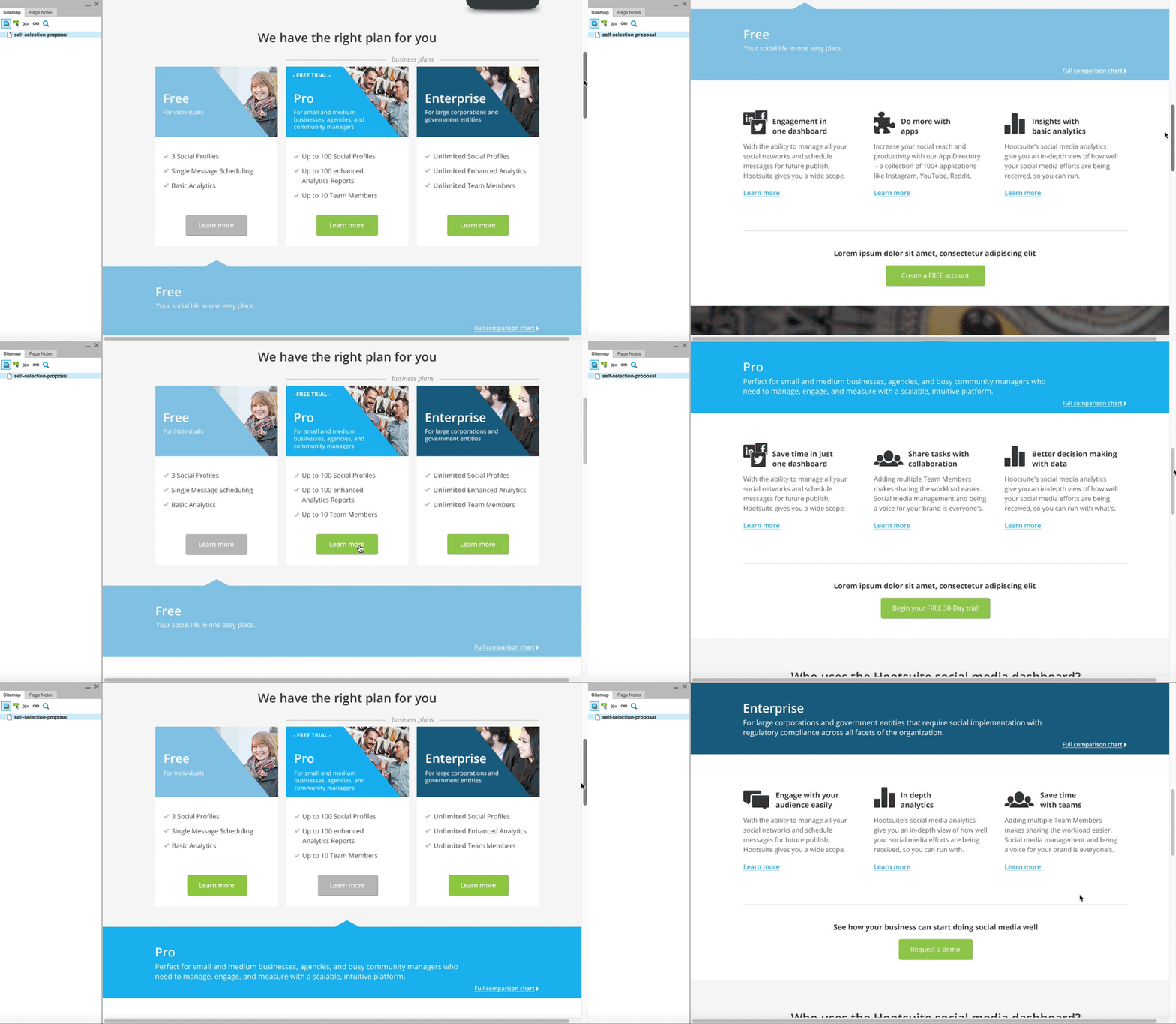
A proposal inspired by the “choose your own adventure” model

My role: UX/UI Designer
Problem statement
Crafting the homepage design is a big task, given its role as the focal point for the majority of website traffic. Recognizing its strategic importance, the Online Revenue team seized the opportunity to present their vision for the Hootsuite homepage.
I worked on a homepage redesign proposal inspired by the “choose your own adventure” model.
The main challenge was resonating with a diverse audience on Hootsuite’s website. To address this, the redesign aimed to streamline the user journey, ensuring alignment with business goals while improving the overall user experience.
Process
I Discovery Phase
Given the broad target audience of Hootsuite’s website, resonating with a specific user group wasn’t an easy task. This challenge became the foundation of the redesign solution. After aligning with stakeholders I identified the main goals, ensuring their incorporation into a user journey map.

II Planning Phase: UX
My design was based on the “choose your own adventure” model—a user flow directing Free, Pro, and Enterprise users along different paths based on their chosen options.
I started sketching this option on paper then moved on to digital wireframes to prototype the flow and identify flaws. I added some basic level of interactivity at early stages in order to see how the design solution would feel when users interacted with it.
My team and I discussed the ideas and iterated on them.

III Delivery Phase: UI and engineer implementation
After some iterations I added more polish to the prototype, working on user interface visuals and more complex interactions. By the time I was working on this step the team and I decided to merge another design into mine. I made adjustments to make sure the “choose your own adventure” section was visually unified with the already defined sections of the other design.
Stakeholders liked the idea because it was a new approach for a home page that had the need to serve various user segments.


Conclusion
This case study reflects not just a design process but a strategic solution to a complex challenge. The “choose your own adventure” proposal exemplifies the fusion of creativity, user-centric thinking, and alignment with business goals.